How many layers have your Photoshop files? And what are the things that you routinely do to your images? And why are you doing them? Let’s have a look at one image of mine, shall we?
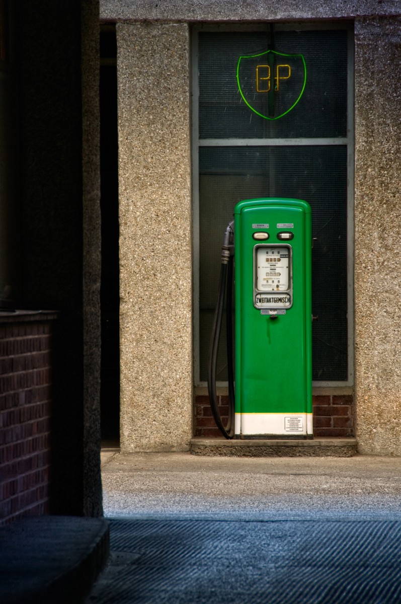
This particular place is a place that I pass by very often. It’s on my way from home to the Underground. I always wanted to take an image of this old pump, because it looks so … old, so out of time and place. Unfortunately there are only two reasons for me to take the Underground: I am either in a terrible hurry, or it rains. Both are not exactly ideal conditions for taking photographs. Yesterday morning it did neither rain nor was I in a hurry, I was only so packed, that I decided not to walk to work. I made three shots, kneeling on the sidewalk, and this is the one that I finally used. Let’s have a quick look at what came out of the camera.
The most obvious difference is the sign on the wall. It is red, which would not be a bad complement to the other vivid color green, but it is extremely high contrast, in an awkward place composition-wise, and it is very modern, compared to the pump. Was that enough reason to throw it out and divert from the path of photographic truth?
Well, if you have followed my blog for any longer time, then you already know my stanza, but instead of repeating it, I shall refer you to my friend Ted Byrne’s classic essay “When To Sign A Photograph?”. I pretty much agree with Ted in this regard, and that’s for “photographic truth” 🙂
Now, having exposed myself as an unscrupulous forger, let me explain my reasoning for taking this sign out. I said it is in a compositionally awkward place. Why that, you ask? That’s a power point, being on the cross of two thirds. Conventional wisdom says that’s good, isn’t it?
Right, but this is an image that I wanted to take for a very long time, and the reason for wanting to take it is the old-fashioned green pump. I always saw the pump, never the sign, thus this must become an image about the pump, and the sign, being in such a lucky spot, does not contribute at all. It is modern, it is high-contrast, high-saturation, it pops out, it competes badly, and that’s the reason why it must go. Cloning out the sign proved harder than I had thought. My first attempt was to create a new, blank layer, and then to clone with a soft brush, always sampling a bit from above, a bit from below, and that with a clone source turned by 180 degrees to avoid repeating patterns. You remember, the clone source palette is one of the innovations in CS3, and it allows you to clone as if from a rotated source. Very handy, and from near, while I worked, the result looked promising indeed, but to my dismay the cloning was clearly visible from a distance. Why that? Well, the problem lies in this particular kind of texture. It is relatively fine and it is uniform, with uniformity being the culprit here.The soft brush had made the cloned texture less crisp, and that difference clearly showed from a distance. Essentially I had replaced the sign with a blotch that obviously stood out.
I could have tried it again with a harder brush and less overlap, and probably I would have succeeded, but in such situations a simpler technique produces superior results. It goes like that: With the rectangular marquee tool I have selected a patch below the sign, copied it with Ctrl-J on a new layer. With Ctrl-T I went into free transform, rotated the patch by 180 degrees and moved it over the sign. Then I added a mask and by painting into the mask with a small, soft brush, I began taking away from the patch until it only covered roughly the sign.
This revealed another little problem. The sign was in a place where a diffuse shadow from above began. The patch was from below, thus it was too light, at least in its upper part. A curves darkening layer in luminosity blending mode and with a gradient mask applied, the layer clipped into the patch layer, took care of that.
In a similar manner I took out a minor distraction in the upper right corner. The drain cover and some high contrast dirt were taken out by conventional cloning. Neither of them had anything to contribute to the pump. They only brought clutter and unrest to an image that was meant to give a calm feeling of nostalgia.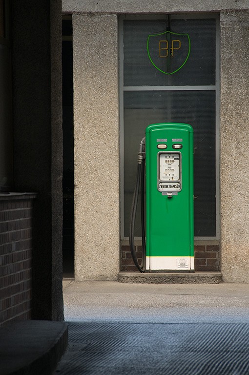 At this point the image was still looking flat, the colors dull, a bit too blue, and the distribution of tones did not leave much detail in the pump.
I tackled contrasts first. The tones in the dark part on the left side were OK, but I wanted to have more detail in the pump itself and on the walls. In other words: I needed to increase local contrast. I discuss local contrast in detail in another tutorial, suffice to say that I used the PhotoLift plugin again, decreasing global contrast by 20% and adding 80% local contrast. The result was pleasing across the image, and I did not use a mask as I normally would. I only used a levels adjustment layer to set a black and a white point. This is the result so far. Suddenly we can see the blemishes in the body of the pump, and the wall textures come forward, just as the pump itself. The levels adjustment was in normal blending mode, thus I have increased saturation as well, which is OK here. Had I wanted to avoid influencing colors, I would have used luminosity mode.
What about the BP sign? It is in the same old-fashioned style as the pump, it has the same green, it would perfectly go with the pump, it only has to come forward. It needs more glow, so let’s make some glow.
The first thing I did was to add a curves layer with a steep rise in the lower tones. I used blending mode “color dodge” to boost the colors as well. This did not give me enough boost, thus I duplicated the layer. Then I made a merged copy of the image so far, blurred it with a radius of 7 pixels, applied it in screen mode at opacity 50%, and these three layers finally gave the glow.
Next comes the idea of balance. In this case it is the balance of tones, and especially tones in the corners. The right upper and lower corner needed to go darker, in order to balance the darkness of the opposing corners to the left.
This is no hard rul
e. Images are thinkable where two light corners on the right oppose two dark corners on the left, but, remember, this is neither an image about corners nor an image about opposites. It is an image about a gas pump. 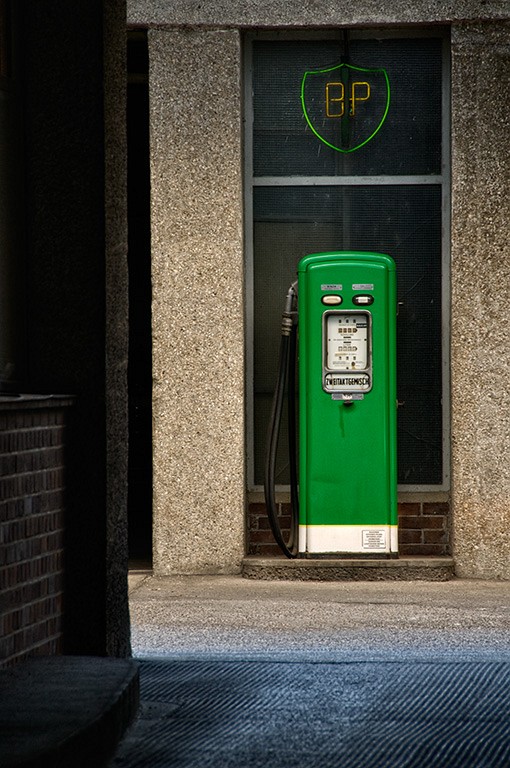 This particular gas pump is fairly in the middle, and therefore the corners need to be balanced.
I added another darkening curve in luminosity mode, and used a mask to restrict it to the lower and upper right corner.
At this point, in many cases I boost saturation as far as it does not burn out any channel. Of course there are images that need much more subtlety, but it is always a good idea to try and see what you get.
Well, what I got here was too much yellow, not enough red and no balance in the blues. Dealing with color, I primarily set color temperature in Camera RAW, but when I find later that I was slightly off, I often use Photoshop’s “photo filters”. They are intuitive, easy to use and can be tamed with masks. Here I used a plain red filter on the bricks to the left and behind the base of the pump. It is subtle, but it makes a difference. Then I raised saturation in general by 20%. Of course this was much too much for the pump, thus I painted in the mask with black over the pump, in effect applying the saturation on everything but the pump.
At this point I felt that the upper part needed some cooling. Therefore I used a cooling filter on the upper right corner and, for balance, on the lower left corner as well.
Of the predefined photo filters, “Cooling Filter (82)” is the most effective, but it has s strong cyan component, cyan cancels red, and that is not what I want here. “Cooling Filter (80)” is rather neutral and “Cooling Filter (LBB)” has a violet tinge. That was what I used. As a last step I sharpened a merged copy in LAB and used an edge mask to restrict sharpness to the edges. Voilà, here we are: 15 layers.
Most of the changes that I have made were rather subtle, but in combination they have changed the image completely. Now it is exactly what I wanted it to be.
Does it show what was there? Certainly not. Does it show what I saw? Probably. In any case it shows what was important to me and made me take the image in the first place.
Coming to the Song of the Day at the end, I wouldn’t have thought that I have only one song with “pump” in its title, one “Jumpin’ In The Pump Room” by Charlie Shavers, and that clearly did not fit. Thus Rod Stewart has his second appearance within days, again from the same live album, this time with “Gasoline Alley”, my only song with “gasoline” in the title. With its backward looking, romanticizing attitude it is probably not the worst match.
There are 5 comments
andreas (2008-03-11)
Actually that's what I learned at the Radiant Vista. Great stuff there.
Markus Spring (2008-03-12)
this picture is great. It has this certain airiness that just evokes positive reactions, and thanks to your in-depth explanation it becomes very clear that this impact comes both from a clear vision and a lot of excellent craftmanship. Really well done.
Thomas (2008-03-12)
Thanks for all the midnight oil that you burned for putting this step-by-step guide together. Much appreciated! 🙂
Needless to say, that the result of all the layering speaks for itself...
mcmurma (2008-03-13)
Wowsers! I really like the image, but the thought of taking 15 layers to get there leaves me speechless.
You may know by now that I don't mess with layers much. I sooner cut my own hair. But I can respect that they are indeed one powerful tool when used properly.
I would have solved the removal of the sign very differently, as I will reveal very soon. In the meantime, its great to see "how you do it" so that I can reflect on how my process differs, as well as how its often much the same.
Brian Auer (2008-03-11)
It's great to see some post-processing insights from other photographers. Sometimes I feel like I spend too much time working on a single image, but in the world of fine-art that's the norm. Like you said, subtle changes (and lots of them) are the way to go when you want to get it right.
💬 Reply 💬